
Here we have the operating system for TapTop, the world's first interactive board game console. We were a team of 5 engineers, a project manager, and me as the UX Designer, working on this operating system.
The TapTop, contrary to the trend of targeting individuals as sales units, is a piece of hardware to be shared with your friends in real life. Our mission was to make it easier for people to engage in face-to-face fun through board games that are becoming a luxury to enjoy because of busy lifestyles.
Tools
User Interview | Affinity Mapping | Competitive Analysis | Persona | Usability Testing | System Design | Interaction Design | Prototyping | Wireframing (Figma & Adobe XD) | Jira | Miro | Usability Testing


When I joined the team, we had already had a prototype product open for beta testing. Its key features included:
-
Touch-sensitive, near-field communication (NFC) enabled LED screen that could react to certain game pieces
-
Automated setup for popular board games
-
Game purchasing and personal game libraries
But we wanted something more catered with a streamlined experience for our customers. So below is my process of making this a reality.
........
To start, everything comes from researching our players and evaluating how well the current interface was performing - finding out if the stakeholders' mission and if the product's current performance was aligning with solving the players' pain points while preserving what they loved about board games.
To do that, I interviewed 10 customers and synthesized their hopes and frustrations into our target marketing persona, Joseph:
Joseph, who grew up socializing with people through board games, is a dad who can't wait to pass on the fun to his 4-year-old who's just starting to grasp basic games and mechanics. The close friends with whom he had shared the gaming culture with had scattered to different parts of the world. These factors make it difficult to recreate the challenging mental sessions where he got to learn about people and their lives through board games.
In addition to Joseph, four proto-personas were developed for different age groups to gain a comprehensive view of how our product affected our customers.

Did our hypothesis align with our players' reality?
Yes! What TapTop was offering, automated setup, video game tutorials, all-in-one-place game library solves many issues players were having with their busy life styles.
So we were on the right track. Now the question became, how effective are we with the current product?
User Pain Points
1. Can’t play mentally rewarding games with their children
2. Cumbersome to carry many boardgames when visiting friends
3. Difficult to teach everyone how to play before they run out of patience
Corresponding Solutions
1. Include games at different levels of difficulty for children to onboard
2. Capacity to host 100+ boardgames on a single device
3. Links to highly-rated tutorial videos for each game
To further find out how well the current TapTop was satisfying our players' needs, I conducted usability tests with 8 users. Here are some findings:
1. Overall appeal is quite low. Familiar functions were missing or not behaving as one would expect. One tester rage quit because they lost patience with the filtering.
2. The settings and accounts was the most severe problem area. Tasks revolving here were nearly impossible. Users were very surprised to find the password reset dialogue to be on the surface. The page also left a large input field for them to write about themselves while there is no friend system.
3. Players felt claustrophobic with the dark bottom menu bar blocking the view for browsing games and awkwardly close to their stomachs.
4. Visually, there was low consistency from screen to screen.
With these results, we decided to move forward with an overall overhaul.

What the research phase told us that our hearts were in the right place, but our features weren't.
To reorganize the navigation and information architecture of the OS, I started by looking at what features we had and evaluating their priority.
Traditionally, what would players expect from a console operating system?
Take Nintendo Switch for example. You'd expect to see basic settings for date and time, account, Wi-Fi, lock screen, and intuitive navigation between games. Because players are also browsing and purchasing games on this device, it also contains traits of Steam, featuring game libraries, ratings, and most importantly, video previews that could be plugged in with how-to-play material like what our persona needed.
To organize these features in a hierarchal way, I prioritized them on this minimal-viable-product map according to our personas, stakeholders, and engineering's input on the amount of effort to be expected.
User Pain Points
1. Can’t play mentally rewarding games with their children
2. Cumbersome to carry many boardgames when visiting friends
3. Difficult to teach everyone how to play before they run out of patience
Corresponding Solutions
1. Include games at different levels of difficulty for children to onboard
2. Capacity to host 100+ boardgames on a single device
3. Links to highly-rated tutorial videos for each game
Issues From Testing
1. Navigation on the system is confusing
2. Sizing proportions weren’t ergonomic when device was close
3. Functions not performing as promised
Corresponding Solutions From Testing
1. Revise sitemap, use consistent visual language
2. Conduct more tests on console, make sure content is legible from far distances
3. Remove features in development and set aside engineering more buffer time
Non-Minimal-Viable-Product Features
1. Remote play capacity
2. NFT pet grooming
3. Game night hosting app

Next, I organized the features onto a sitemap to show how the logic would link from one feature to another.
Starting with key features and most-frequented functionality, branching out to more obscure and optional future phases of the system.

I then dissected in detail each feature and sector with user flows. This helped the design and programming come together on the general mapping for each feature and how they connect with each other.

Now that the initial research and definition of the features are in place, the iterative design phase began. Should we make the experience itself game-like? If so, what should the world be? After exploring our options, we cut our aesthetics to a bare minimum. The main function of this 16lb machine was to access many different board games. So our main flow was to present the list of games and their details.


How did these screens do? I did another round of testing with 8 players. In summary:
1. Overall, the ease of use has drastically gone up. Some features were still not functioning, but all users were able to find games and learn about them intuitively.
2. The biggest change was the settings, where before the tasks were impossible to finish are now easy.
3. Players were not used to using a physical button to exit from games and thought that looking for the hard reset button would be the second option to look for, if they wanted to exit from a game.
At this point, it's confirmed that the site map and information architecture on each page were in sync with user expectations.
Enter the late-game investors' opinions, which resulted in design upheaval.
If the final version below looks contrary to the responses from testing results, it is because a month before releasing the update for this version of the interface, leadership requested to reskin the pages in a symmetrical, mature style that the investors wanted.
Instead of prioritizing making content accessible across the table for all ages and users with large fonts and bold visual cues, the design would undergo a make-over with more toned-down colors and standardized layouts. Still keeping the sitemap, I did my best to keep the information architecture intact with the new framework.
GAME BROWSING
Here we have the finalized view of the games, a home view of featured and recently played games, and the game detail page.
We kept the filtering and major CTA central to the screen so that players can access the controls no matter where they are sitting at the table.


SETTINGS
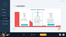
The settings tab consists of 9 branch functions clearly on the left:
Device | Wi-Fi | Bluetooth | Update | Account | Subscription | Payment Info & Check Out| Alexa Account | About
Shown on the right are Alexa, Subscription, and Wi-Fi variations.
The challenge here was to display the boring procedures in a TapTop fun way.


QUICK SETTINGS
In addition to accessing settings within the software interface, we also had a physical button that could summon a quick settings menu for speedy control over currently running games, power state, and volume. In case your game froze and need a backdoor out, the menu would appear to save the day!
To the right are some dark mode variations of other screens.


With templates of the guiding pages done, I fleshed out the rest of the flow and packaged them with annotations for the engineers.
Here's a cropped sample from the Setup Wizard:

Initially we adopted a light mode to make the space cater to families with younger kids, since they were our target market. After research, we arrived at the understanding that most board games are played near children's bedtime so we decided to make a night mode.
Next Steps
A major takeaway from this projects was that although we aligned leadership expectations to customer needs from the start, we could have saved manpower for the team by keeping our investors more updated on the product to avoid future last-minute changes.
As always, with more time, feedback from users from the make-over would have been extraordinarily helpful as a guideline. Do gamers appreciate a more playful interface, or a familiar one?
-
Include all stakeholders in the process to make sure expectations are in check
-
Buffer time out for testing
-
Different phases of projects may require appealing to respective segments of the accessible market


Thanks for scrolling!